There are three main types of symbols that we use throughout the world and the web and I'm going to be conducting some research oh the differances between them.
The first type of symbol I'm going to look at is called an: Icon
An Icon is a symbol or small picture that resembles what you or the person is trying to get across there are lots of examples of these all over the place for example:
Weather signs and no smoking signs are icons:
The Second type of symbol i'm going to look into are called: Index's
Index's are alot like Icon's but instead of resembling something there is a direct link between the image/sign and what it means... for example road and street signs:
The last type of symbol I'm going to look at is actually called: Symbols
Symbols have no logical meaning to what it stands for but we all know what it means regardless there are lots of examples for this and most of them are featured online or on web-pages... for example
Favourites/bookmarks have a star sign next to it.
And the safari logo simply has a compass.
Contrast/ differance:
Contrast is how something looks when it is put against a certain background or object, the most basic way of explaining this is that if you had a white background the object would not also be white as there would be no contrast and black would be the best shade to use for example this writing would be harder to read if the shade changed because there is no contrast
Repetition/ rhythm:
Repetition is important in art because it adds some structure to a picture and can stop an image from looking too cluttered or abstract, repetition can also be used in some cases to create an optical illusion. For example in this picture of these red chairs it would look odd and out of place if there were a few random coloured chairs in amongst the others:
Alignment:
Alignment is simply how something is set out on a page; the idea is that if everything is made with alignments in mind then you wont get lots of cluttered mess and overlapping. Alignment is very important when using text because for example if I suddenly started changing the alignment people would get confused and not know how to follow page.
Proximity/ space:
Proximity is all about how close an object is to another and is important in making things clear on screen. Proximity is in everything from pages to roads… things cannot be too close to each other simply because it would look messy or not work.
For example everything on this blog has proximity; space between pictures and words.
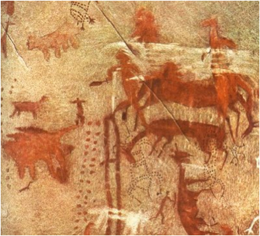
The history of picture grams go back as far as human history it’s self from cave paintings to colossal images drawn into mountainsides or plains.
Here are some pictures of cave painting over half a million years old:
These paintings are the first ever form of visual communication as the person whom made these paintings clearly tried portraying some form of story or scene for others to see. Even though these painting were very un-developed and new, you can still easily make out what most of the images are.
Further down the line humanity started using pictures for communication for example the next Civilization to use picture grams were the Egyptians who used pictures of things to make up an alphabet of “Hieroglyphics” which is very similar to our alphabet today. However these sorts of images are known as Abstract images as if you didn’t know the hidden meanings of the hieroglyphs you would not be able to fit together the story trying to be told. These are also historical images as they define a culture.
Here are some pictures of some Egyptian Hieroglyphs:
Humanity still use these methods to exchange information between other people who study what the meanings are because today every language is made up from symbols or pictures which each have a specific meaning or sound.
For example the Chinese are still using calligraphy for their language:
These are also historical images as they define culture and society.
The only difference between modern calligraphy like this and the cave paintings is that when you see a cave painting no matter who you are you can make it out as it portrays events or objects, this is called a linear image which is when you look at the image it tells you something straight away without any hidden meanings where as today if someone wrote on a wall in a modern language it would be an Implicit or Abstract image as you cant tell what the meaning of the image is without having studied the language so there for it would have a hidden meaning to someone who wasn’t familiar with the culture.
All together this has been the most effective way of carrying a story or event through the ages however I feel that today we have moved away from the simplicity of explicit pictures and have become to engrossed in different cultures and have produced harder to understand abstract languages. One of the best points to this is that the image can be as big or small as the creator wants, depending on he/she wants it in a book or on the side of a mountain; e.g.
These are called “Geoglyphs” they are images of something that has used the earth as a canvas, these images are usually on a colossal scale compared to the cave paintings and can be seen by looking down miles in the air. These are often explicit images as just by looking at it you can tell what it is.
The last type of image I’m going to research is scientific imagery where things don’t necessarily at first resemble an image but after a while of looking they do in-fact display an image, these images are known as optical illusions
This concludes my research on the different forms of visual recording and methods used throughout ages even though there are still many more such as digital imagery and propaganda but I believe I have done what I’ve needed to, in order to understand the differences between explicit/literal, implicit/abstract, emotional, scientific and historical imagery.
This is the first time i've used this blog and i shall use this to save my work on as I progress through my college course of interactive media and games design so most of the work uploaded will be for a game i'm designing in my class.
I will use this to improve on my work where it's needed and hopefully receive credit when it's due.


